Reminder: the
January Washington Blogger Meetup is tomorrow, Wednesday, January 16, 7pm at
RFD, across the street from the Verizon Center (come earlier if you want to load up on happy hour drink specials).
Early attendance estimates look strong -- must be New Year's resolutions. Please join us -- all are welcome.
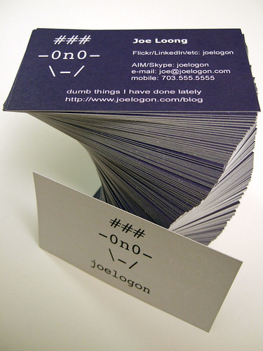
Just in time, too, I'll have a fresh batch of
business personal calling cards:
 You wouldn't believe how hard it was to get that phone number.
I'd been working on the design for a while (such as it is -- as you can see, even when it comes to graphics, I work in text), but I only got around to ordering them after I got a
VistaPrint coupon in a recent Amazon order.
I ordered 500 cards, plus a self-inking address stamper, and some Joelogon post-its that I don't need (except as filler to get to $25 and free shipping).
It was mostly in the nature of an experiment and I was expecting the worst (which is why I didn't spring for the premium card stock), but I have to tell you: I was pleasantly surprised by the results. The very first card was miscut (there was a white border showing on one edge), but the rest look fine.
I'd ordered them on January 10th, they shipped on the 12th, and got here today (the 15th). I was pleased, which shows that it's all about managing expectations, since the note on free ("Slow") shipping said up to 21 days.
As to the design (such as it is):
* The
ASCII face is not, strictly speaking, a logo -- it's just something I've been using in my mail .sig since the 90s. Nor is it really supposed to be me, I guess. Though it has glasses and looked slightly more like me when my hair was short and spiky.
* The
blue is just... blue. It's a web-safe blue, though. (It's also not as spotty as the photo suggests.)
* This came to me late in the game, but I tried to put the
viewable stuff next to the
eyeglasses, and the ways you could
"speak" to me next to the
mouth. Though I didn't want to load up the card with too many Web 2.0 companies (especially since I try to sign up as joelogon whenever I can -- hence the "etc." I probably should have listed Twitter, though. Facebook, too.)
I probably should have tried harder to line up each facial element with its associated info, but I wanted to keep the spacing even to make it more readable. Which was more important than a metaphor of dubious utility.
* I stayed with a
matte finish, and kept the back side's background
plain white. Mostly because it was cheaper that way, but I like being able to write notes on people's business cards ("knows so-and-so," "hound mercilessly," "avoid at all costs," etc.), so I wanted to make it easy to do this.
I've already given one to a former cow-orker I ran into this afternoon at the coffee shop; we'll see how long it takes to get rid of the other 499. Come to tomorrow's meetup and I'll give you one.
Labels: dc blogs, photos, self-promotion, to-do
