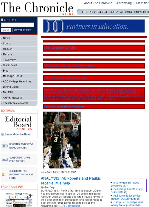
First Round Losses Cause Really Bad Web Page Design
I was disappointed (though not really surprised) by Duke's first-round loss in the NCAA tournament yesterday.
Outside of the feeding the ravening glee of the ever-growing chorus of Duke haters, I notice that another bad effect was on the campus newspaper Duke Chronicle's Web site, which featured an eye-bleeding, blue on red, 613-pixel tall "Breaking News" banner (with photo) on every fucking page on the site:People, I know your brains are fried because you're on Spring Break, but the game didn't end late enough for you to be so sleep-deprived that you didn't realize you were making such a silly design decision.
Outside of the feeding the ravening glee of the ever-growing chorus of Duke haters, I notice that another bad effect was on the campus newspaper Duke Chronicle's Web site, which featured an eye-bleeding, blue on red, 613-pixel tall "Breaking News" banner (with photo) on every fucking page on the site:People, I know your brains are fried because you're on Spring Break, but the game didn't end late enough for you to be so sleep-deprived that you didn't realize you were making such a silly design decision.
Tags:
Labels: design, duke, dumb things

