Hints From Heloise Is a Lousy Tipper (also, the Tipping.org redesign blows)
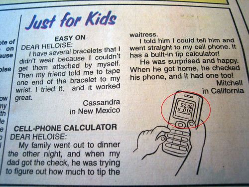
I was getting a jump on the Sunday comics this afternoon (they arrive in a hermetically sealed package on Saturday), when I saw this marginally helpful and profoundly disturbing hint in the The Just for Kids section of Hints from Heloise -- it's the one on tipping:
What's worse, though, is that the accompanying graphic demonstrates how to use your cell phone to calculate an 1.5% tip on a $52 tab, which comes out to an extravagant 78 cents.
If you're going to leave 1.5%, you might as well just stiff the waiter completely. That way, at least you'll be seen as a cheap asshole, instead of a complete retard.
Obviously, the illustrator either:
But the inability to move a decimal over a spot and double it (20% is usually my base tip -- it's just easier) without a calculator?
Yeah, technology is making us dumber.
Tipping.org's Redesign Blows
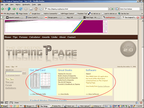
Speaking of tipping etiquette, I was just going to link to the main page of tipping.org and be done with it. However, thanks to their Web 2.0-ish redesign, they've done a great job of hiding the useful information -- I finally had to use the site search.
Here's the path to the Tip etiquette info, which is presumably why you're visiting in the first place:
Here's a bit of free advice:
It reads:
"DEAR HELOISE:Yes, apparently the knowledge of how to determine a tip without a calculator has bypassed the family of young Mitchell in California.
My family went out to dinner the other night, and when my dad got the check, he was trying to figure out how much to tip the waitress.
I told him I could tell him and went straight to my cell phone. It has a built-in tip calculator!
He was surprised and happy. When he got home, he checked his phone, and it had one too!Mitchell
in California"
What's worse, though, is that the accompanying graphic demonstrates how to use your cell phone to calculate an 1.5% tip on a $52 tab, which comes out to an extravagant 78 cents.
If you're going to leave 1.5%, you might as well just stiff the waiter completely. That way, at least you'll be seen as a cheap asshole, instead of a complete retard.
Obviously, the illustrator either:
- Misplaced the decimal
- Is an inveterate cheapskate
But the inability to move a decimal over a spot and double it (20% is usually my base tip -- it's just easier) without a calculator?
Yeah, technology is making us dumber.
Tipping.org's Redesign Blows
Speaking of tipping etiquette, I was just going to link to the main page of tipping.org and be done with it. However, thanks to their Web 2.0-ish redesign, they've done a great job of hiding the useful information -- I finally had to use the site search.
Here's the path to the Tip etiquette info, which is presumably why you're visiting in the first place:
- Go to the main page (tipping.org)
- Click "Tips" in the top nav bar (goes to tipping.org/tips/)
- Click "The Tips" in the left nav bar (goes to tipping.org/tips/tips.html)
- Scroll past the sales tout for tipping books and stupid plastic tip cards that takes up the entire above-the-fold screenspace on every damned page and finally click "United States - Domestic Guide (goes to tipping.org/tips/us.html):

Hope you like this sales tout, because it's the first view of every damned page (Firefox, XP, 1024x728)
Here's a bit of free advice:
- Trim that silly mirror-image off the bottom half of the logo (it could be worse -- at least it's not a shimmering-lake-effect java applet); that'll free up 72 pixels (a good inch) or so of vertical screen space
- Put some actually tip content on the Tips main page and category page -- the Webster's definition that dominates tipping.org/tips is especially useless.
Always read the comics first.
Tags:
Labels: photos

2 Comments:
That is what we would call in Australia a "deadshit move." Or, "those customers are deadshits." It's not just that they screwed up with the calculator, it's also that they should know how to do such a simple calculation in their heads.
By E :), At
12/10/2006 3:20 AM
e :) -- you haven't been away that long; have you already forgotten how lazy and dumb we 'Murcans are? -- Joe
By joelogon, At
12/11/2006 2:20 AM
Post a Comment
Links to this post:
Create a Link
<< Home